
Styling Flatlays 101: A Guide for Beginners
Flatlays are more than just a photography trend; they're a powerful tool for brands, especially in the stationery and wedding industry. A well-styled flatlay can tell a story, showcase your products, and even become a viral sensation. If you're new to the world of flatlays, this guide is for you.
The Basics of Styling Flatlays
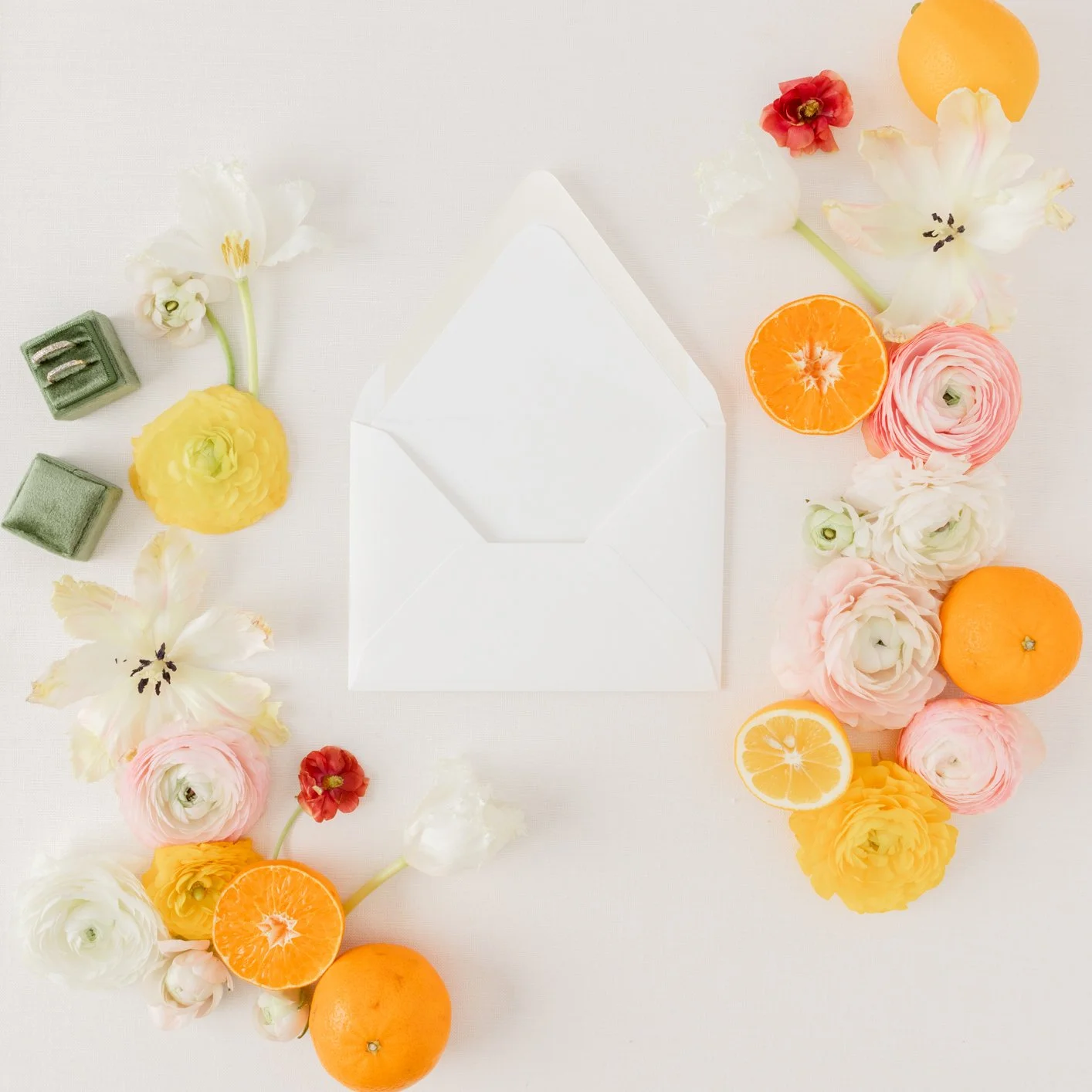
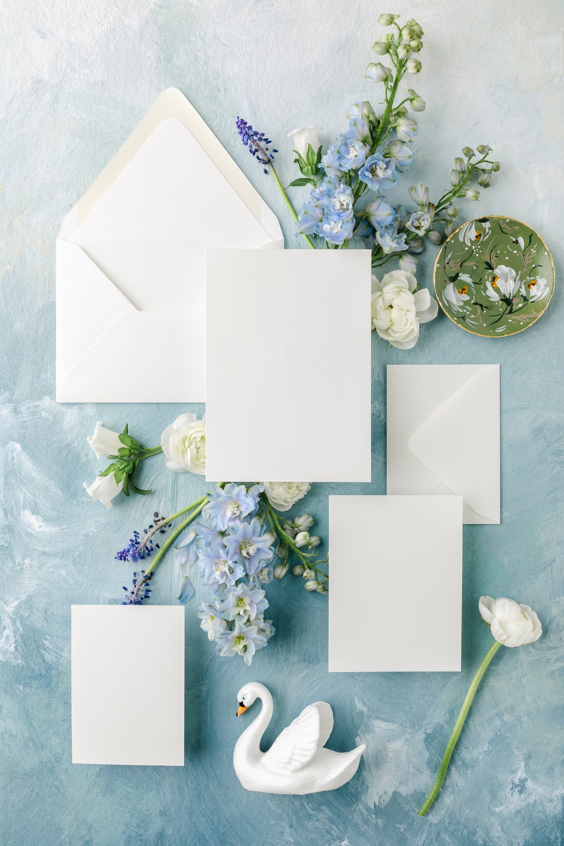
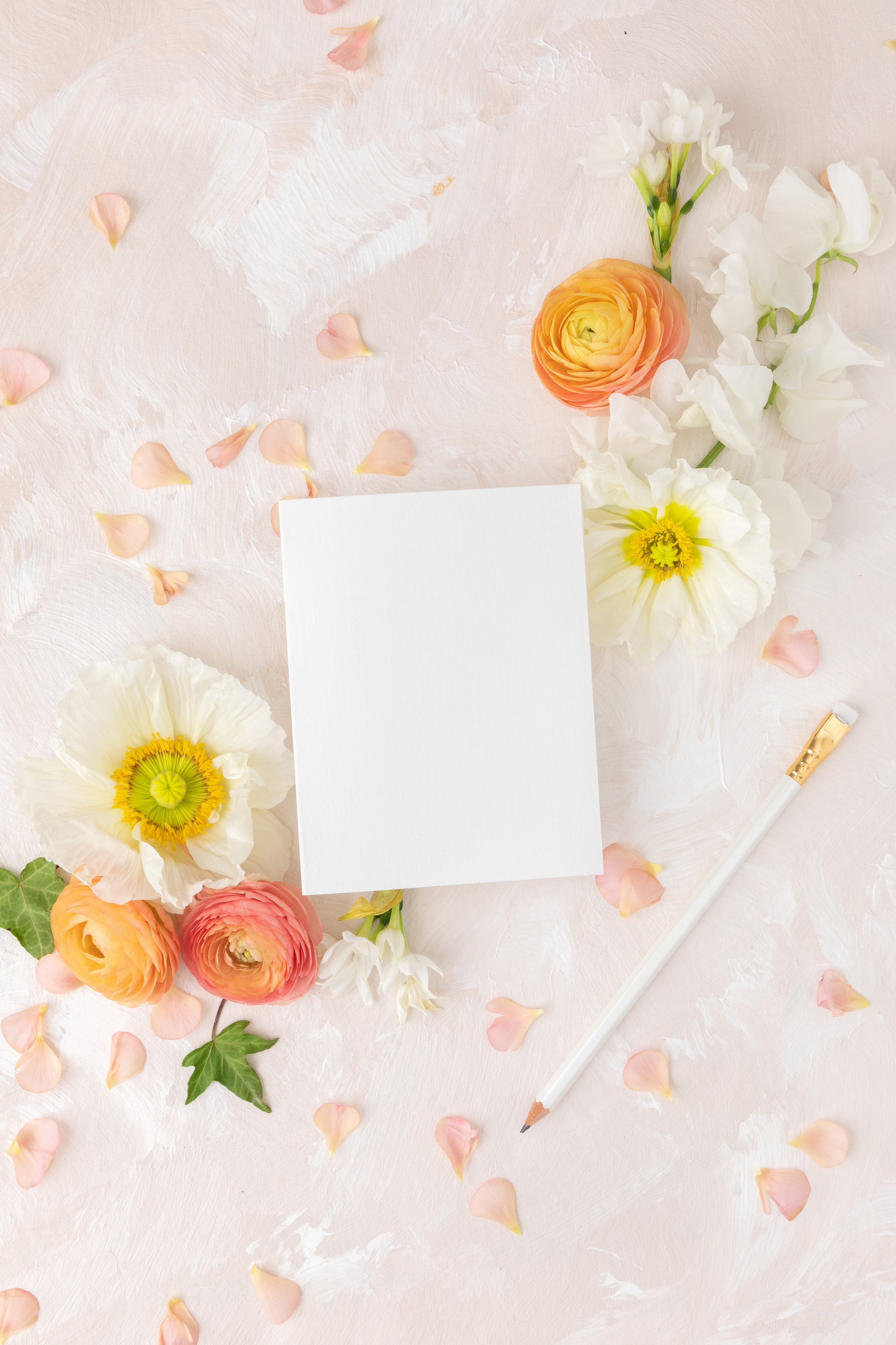
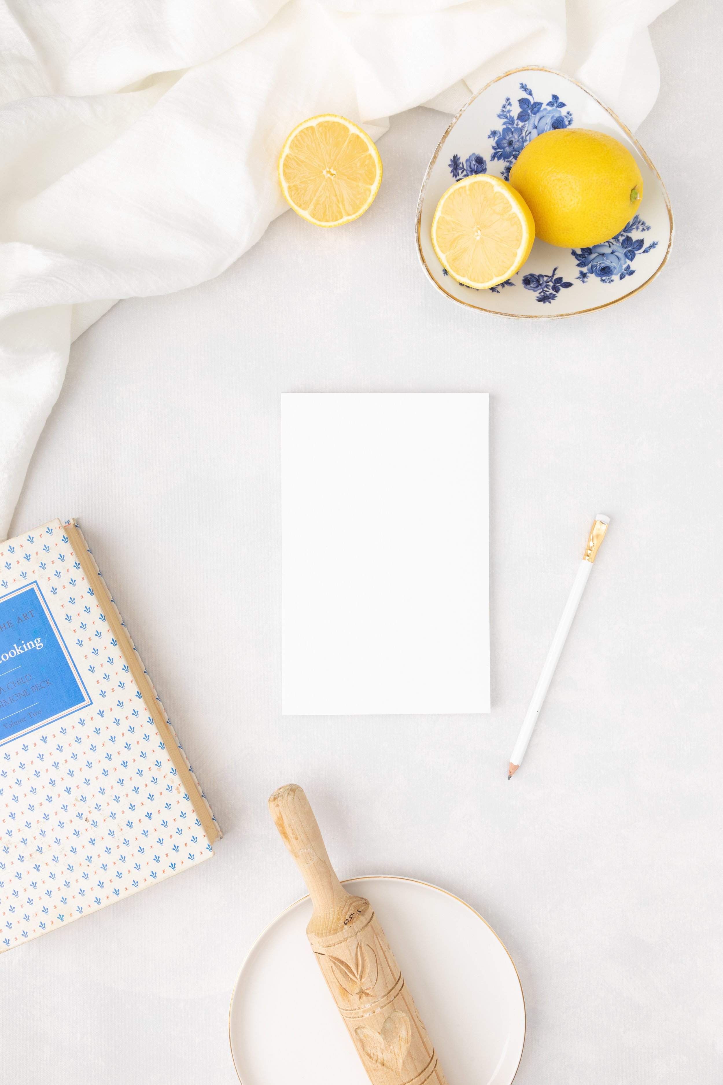
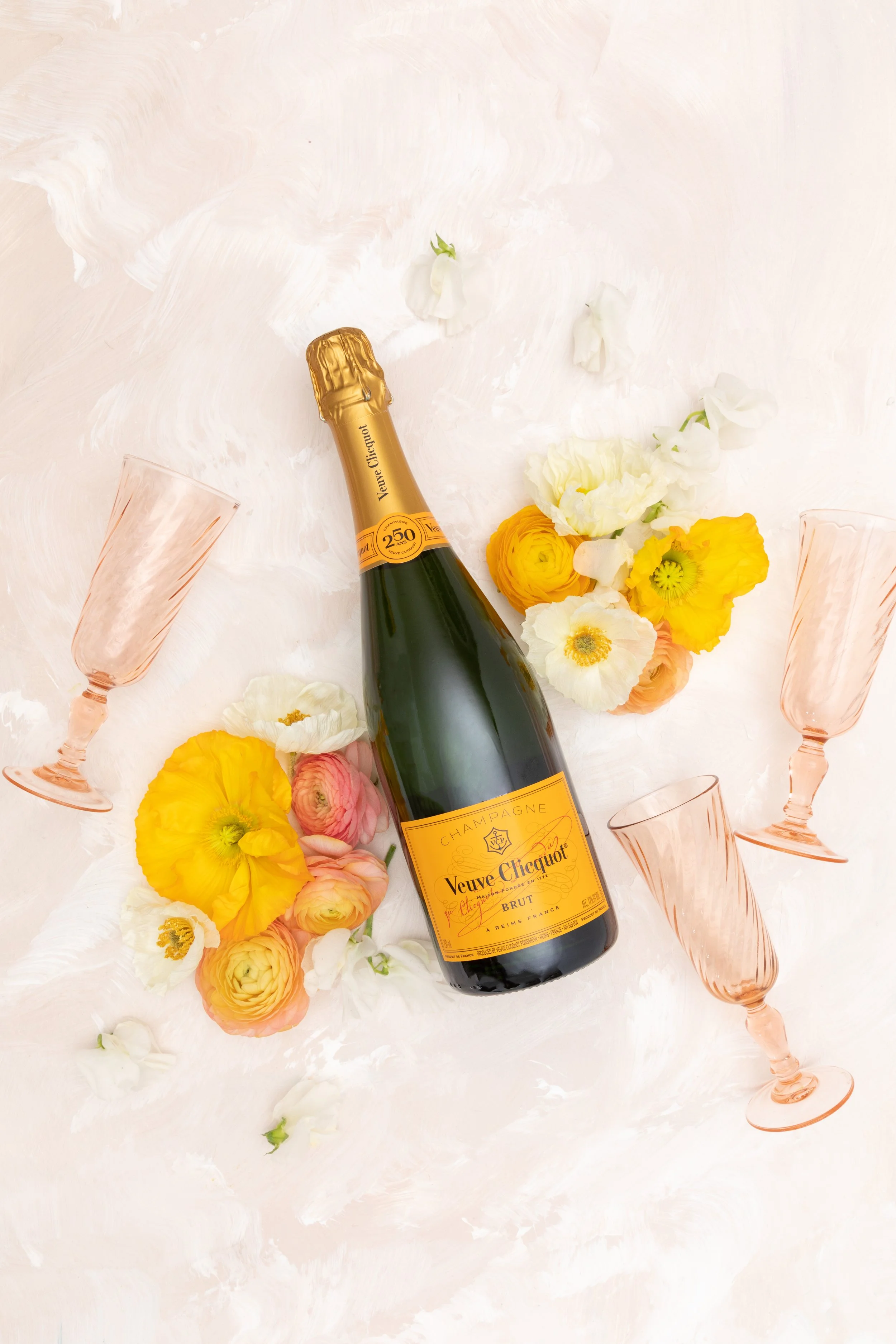
Background
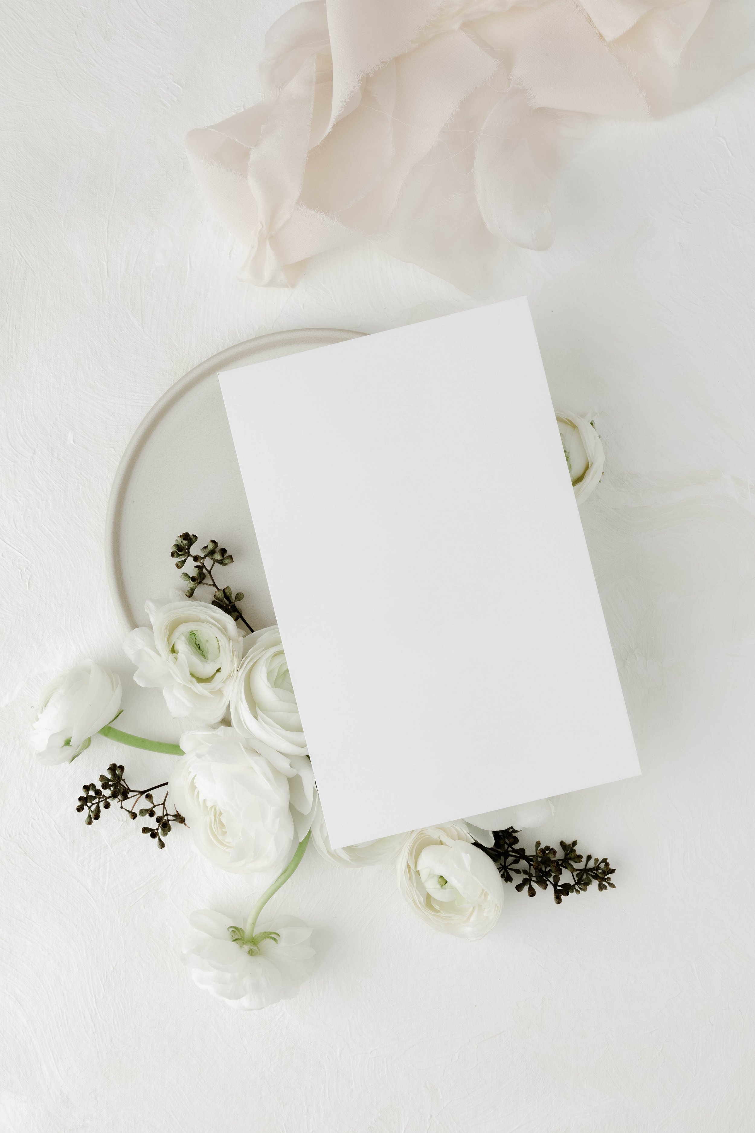
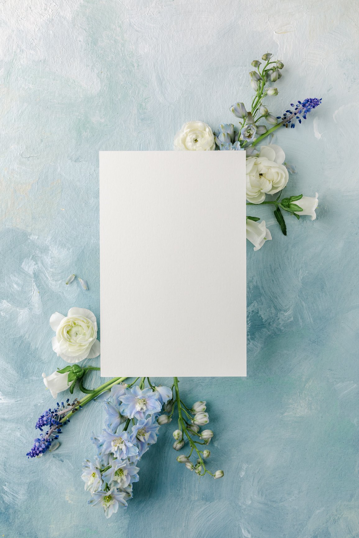
The background sets the stage for your flatlay. Whether you opt for a simple white backdrop or a textured surface like wood or marble, make sure it complements your products without overshadowing them.
Composition
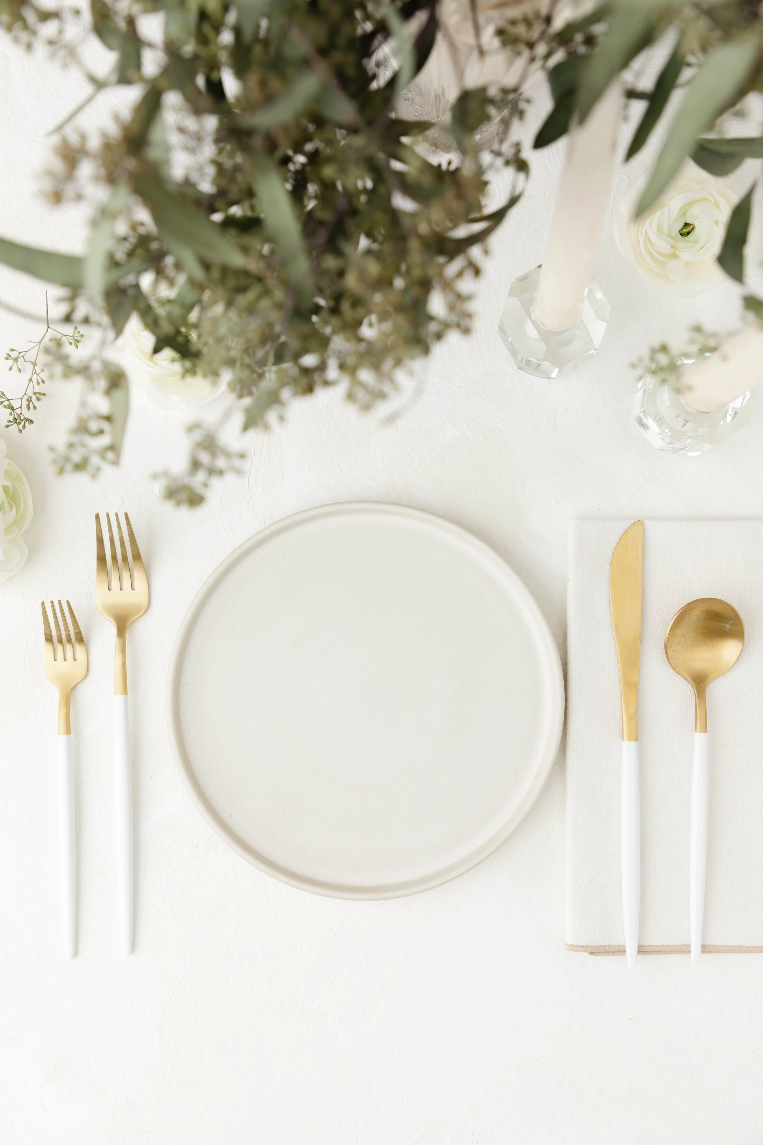
Arrangement is key. Use the "Rule of Thirds" as a guideline to place your items. The most important elements should be at the intersections of the imaginary grid lines.
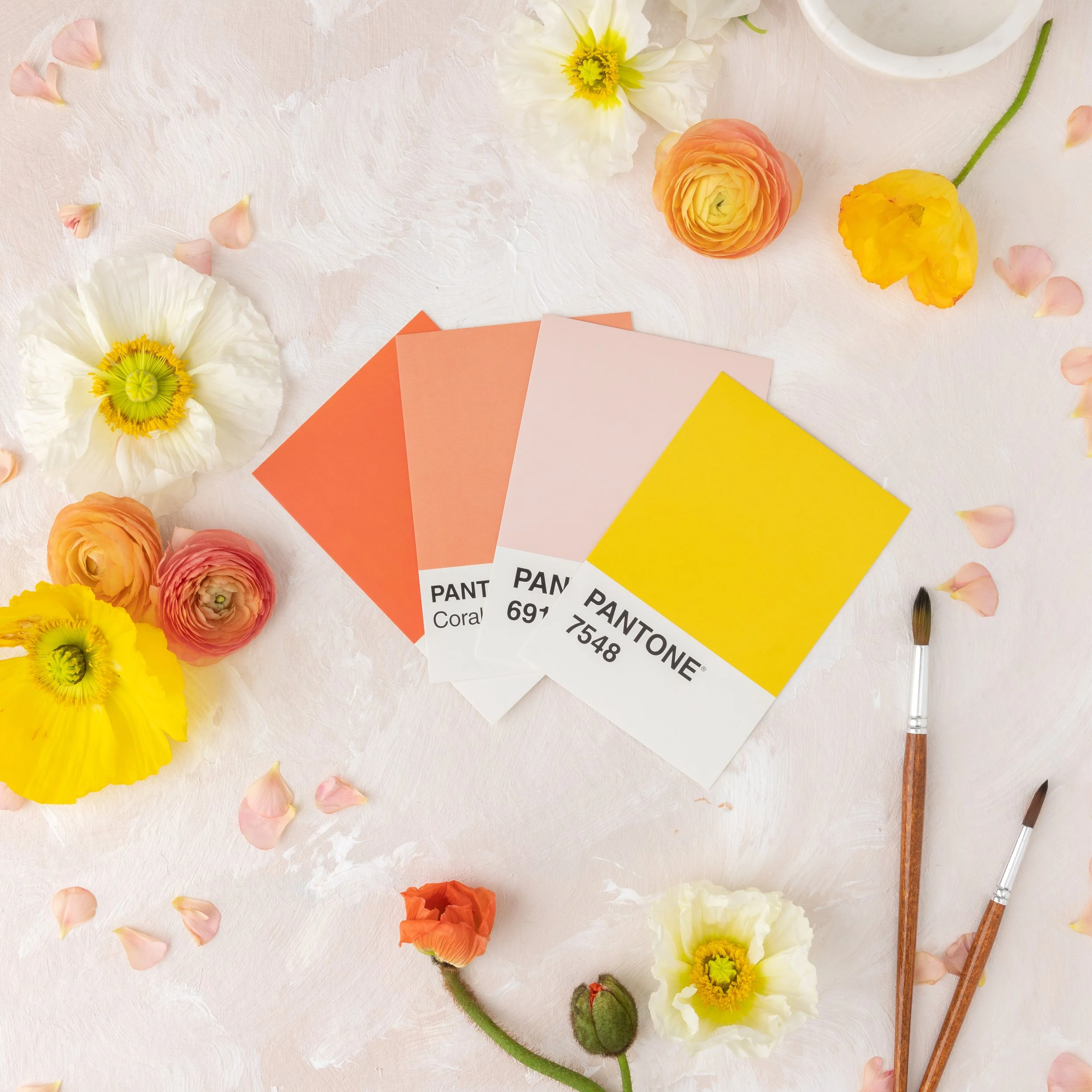
Color Scheme
A cohesive color scheme can make or break your flatlay. Choose colors that align with your brand's aesthetic and create a pleasing visual harmony.
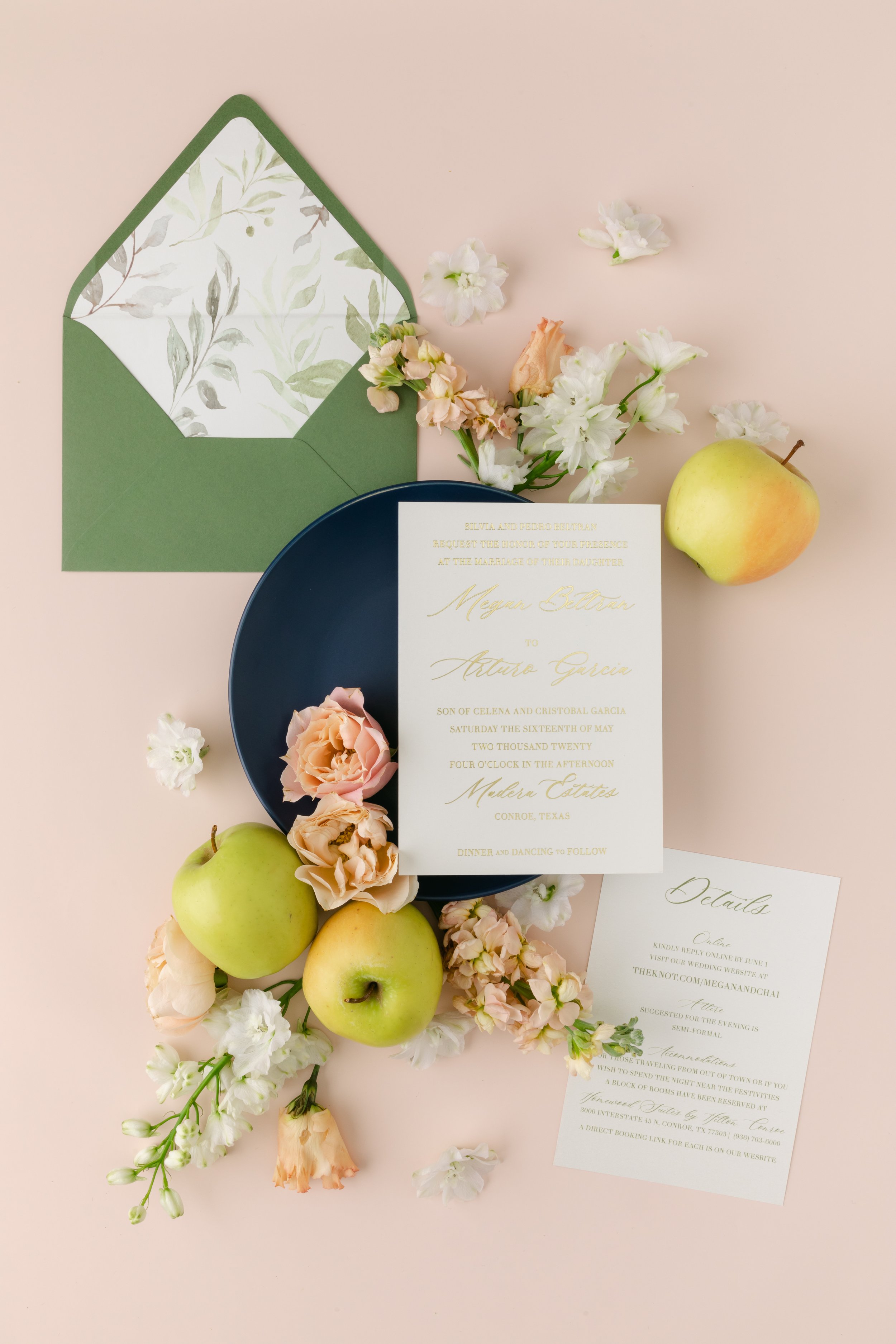
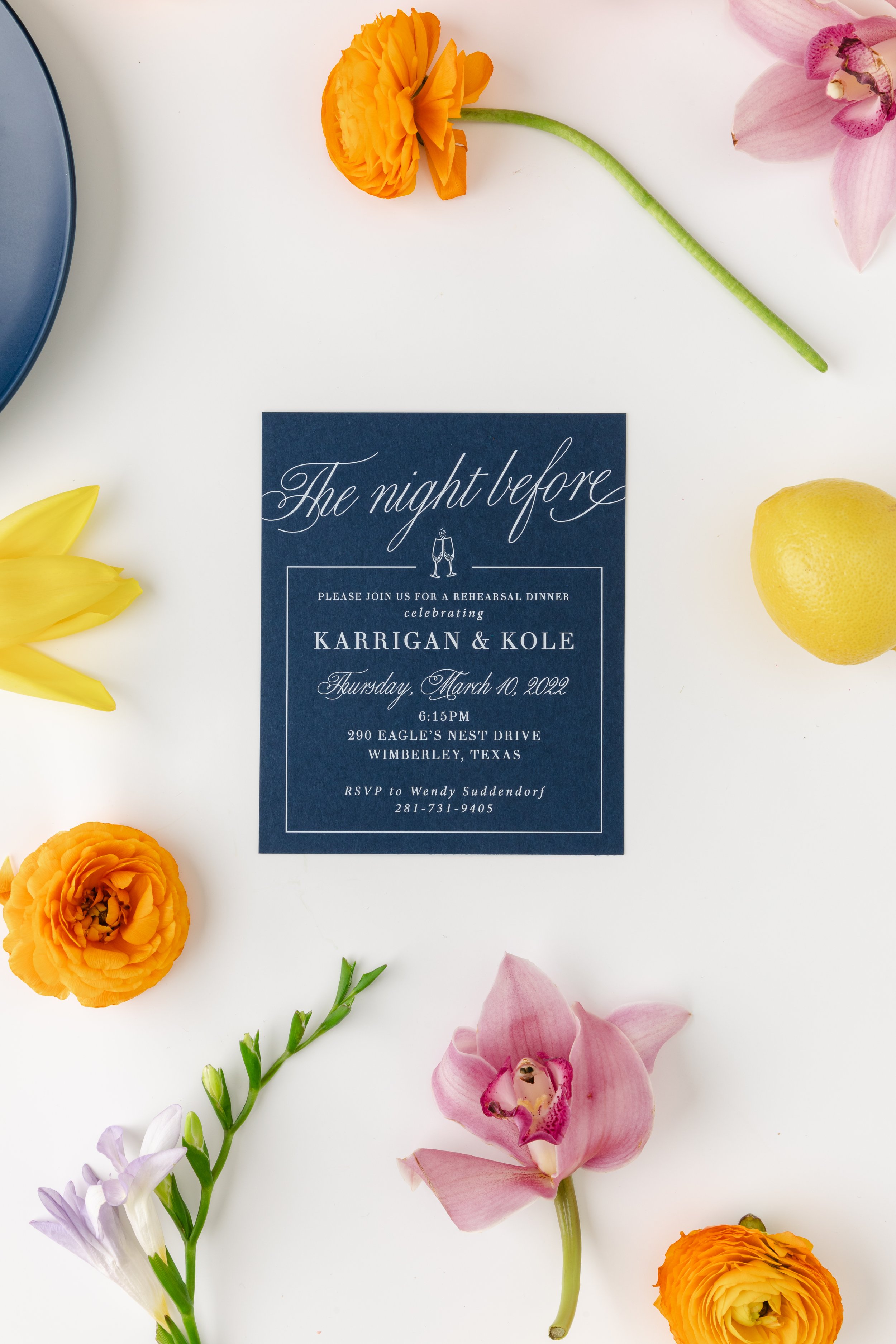
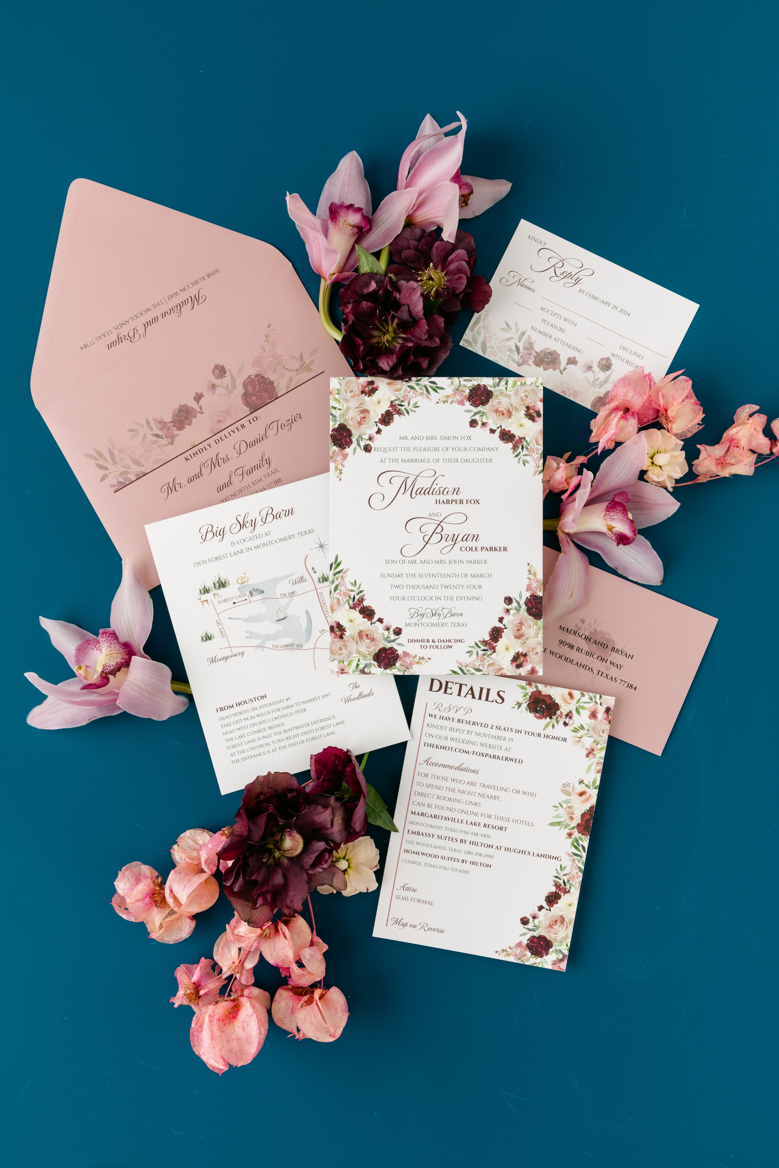
Tips for a Stunning Flatlay
Use Natural Light
Natural light is your best friend. Shoot your flatlays near a window or under soft, diffused lighting to avoid harsh shadows.
Keep It Simple
Less is often more. Don't overcrowd your flatlay; give each item space to breathe and be noticed.
Add Some Personality
Incorporate elements that give a sense of your brand's personality or the lifestyle you're promoting. This could be anything from a handwritten note to paintbrushes to antique books.
Creating captivating flatlays is both an art and a science. With the right background, composition, and color scheme, you can craft flatlays that not only look good but also resonate with your audience.
Ready to take your flatlays to the next level? The Styled Stock Shop Membership offers a plethora of professionally styled flatlay images to inspire you.

Want to elevate your flatlay game?
Click here to explore our membership options and start creating flatlays that captivate and convert.